
Search By Square Foot
• Up to 1000 Sq Ft
• 1001 - 1500 Sq Ft
• 1501 - 2000 Sq Ft
• 2001 - 2500 Sq Ft
• 2501 - 3000 Sq Ft
• 3001 - 3500 Sq Ft
• 3501 - 4000 Sq Ft
• 4001 - 4500 Sq Ft
• 4501 - 5000 Sq Ft
• 5001 Sq Ft And Up
Search By Square Foot
• Up to 1000 Sq Ft
• 1001 - 1500 Sq Ft
• 1501 - 2000 Sq Ft
• 2001 - 2500 Sq Ft
• 2501 - 3000 Sq Ft
• 3001 - 3500 Sq Ft
• 3501 - 4000 Sq Ft
• 4001 - 4500 Sq Ft
• 4501 - 5000 Sq Ft
• 5001 Sq Ft And Up
.png)
(1).png)
by Lauren Busser The House Designers’ Contributing Writer
The New Year brings about a lot of new resolutions and that makes it the perfect time for a change. Whether you are looking to redo one room, an entire room in your house, or are just getting ready to design the interior of your new home, the 2014 color palettes have colors you will absolutely love. Color and paint giants like PANTONE®, Benjamin Moore®, and Valspar® are all working to deliver the trendy colors that today’s consumers are craving.
In recent years, homeowners have been drifting away from the stock white walls and into bold color and design choices. Still, with all the advice, it’s hard to navigate through it all. That’s where a company like PANTONE® comes in. PANTONE® is the global authority on color and is highly respected in the design community. For 2014, they released nine color palettes to help designers and their clients find a color scheme they will love.

“Consumers are becoming increasingly color savvy and color aware,” said Leatrice Eiseman, executive director of the Pantone Color Institute® in a press release. “With consumers seeking distinctive styling and considerable substance more than ever before, it is critical that retailers and designers be aware of future color trends. To successfully entice consumers, colors and color combinations must be appealing, evocative, transformative and most importantly, on-target.”
PANTONE’s® nine palettes include: techno color, intimacy, tribal threads, collage, fluidity, physicality, sculpted simplicity, moda, and eccentricities. The inspiration for the palettes spans everything from human relationships, to cultural ties, technology, street art, and graffiti.

If wading through 74 shades of color seems a little extreme, but you still want PANTONE’s® expertise, you can check out their paint line they’ve developed with the help of Valspar Paint®. With the mission of helping people connect to the power of color, they have launched the PANTONE UNIVERSE™ Paint Collection by Valspar®. This collection is available exclusively at Lowe’s stores nationwide, and will allow you to select on-trend colors that evoke a range of emotions and moods. The collection consists of over 100 hues that range from classic neutrals to saturated brights, including the PANTONE® Colors of the Year for 2013 and 2012 (Emerald and Tangerine Tango).
The PANTONE UNIVERSE™ paint collection allows consumers to access the latest color trends in interior design and fashion and bring those inspirations to life. Couple PANTONE’s® colors with Valspar’s® highest quality paint and you are sure to bring colors to life.
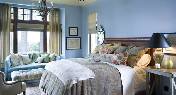
Valspar® isn’t the only paint company making waves in the world of interior paint. Late last year Benjamin Moore® also announced its Color of the Year for 2014. The ethereal blue that Benjamin Moore® chose to represent 2014, is called Breath of Fresh Air and even though it is distinctly blue, it serves a new neutral that is very functional in modern design. and is supplemented by the 2014 Color Trends Palette. The palette consists of 23 carefully selected shades that play off of each other beautifully. The palette has a harmony together that allow colors to flow seamlessly.

"We chose Breath of Fresh Air because we were seeing it across several different environments—it's our new neutral," said Ellen O’Neill, Benjamin Moore’s® Creative Director in a press release. "Our Color of the Year and Color Trends 2014 palette is a direct result of the fresh color cues and pastel trends we've seen throughout the home furnishing, fashion and even pop culture landscape."
The Benjamin Moore® palette for 2014, is more focused, taking color cues from things in the furnishing industry, such as textiles, carpets, and wallpapers. Their palette focuses on hints, tints, and whispers of colors without anything looking too pastel or easter-egg like. The result is a color that is enduring, and that will flatter your possessions and art.
Whether you are looking to completely redo your home or just a couple rooms remember that paint colors should be something that makes you happy but is also enduring. With the help of color palettes you can find colors you may not have thought of and maybe find a new favorite color for your favorite room in your new home.
READ MORE: Communicating Color: Color Terminology to Help You Get What You Want