Color Trends: 3 Tips for Using 2017's Hottest Hues
by Kate Smith, Color Expert at Sensational Color
Putting your personal stamp on the colors for your home takes a good dose of confidence with a bit of courage. For many people it is far easier to follow the latest trends than create their own scheme. I say to do both.
Think of the color trends as you would the menu at your favorite restaurant. You may choose items exactly as they are suggested or you can "have it your way" by making changes so that your meal suits your taste exactly. Browse the colors currently on trend for inspiration or as a starting point. Then choose colors to substitute or add on to those suggested to create your personalized look.
For 2017 I have put together three of my favorite tips for using color trends to boost your confidence as you choose the colors for your next decorating, remodeling or new construction project.
Tip #1: Know the difference between a fad and a trend
You find a FAD
People often refer to fads and trends as if they are one and the same. This is not the case. There is a difference between a fad and a trend.
A fad is a here-today-gone-tomorrow color, design or style. Fads rise fast. They seem to explode onto the scene out of nowhere. They are often mainly popular at first with a particular age group or type of person and then grow from there. Remember Day-Glo colors, anyone?
Fads are fun and create followers. They are relatively short-lived and fade from the mainstream within two years or less. Still they are often long remembered after they are gone because so many people shared the experience of the fad even if they didn’t participate in it.
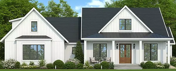
A balanced exterior design can still pop without being too flashy, and sticking to trends rather than fads will keep it looking ageless.
You track a TREND
A trend comes about as a result of myriad cultural, political, social and economic factors that interact to influence our preferences. Trends respond to human needs and emotions. Trends become trends because they address an unspoken need or desire that many people share at a particular time.
Currently looking to our lineage gives us feelings of strength and stability. Out of this comes the trend of reinventing classic and historical designs rather than seeking something completely new. This also signals that the trend of placing importance on neutrals for both home interiors and exteriors will continue.
People notice trends slowly and are usually unaware of a trend at first. As it becomes more prevalent, it crosses into different groups of people, and expands into more geographical areas and types of products, which is how it gains strength, power, and longevity.
Tip #2: Don't jump on or off a trend too quickly
In the past, a typical trend would last centuries or at least decades. Today, a trend generally lasts for four to seven years.
Many people think that a color trend lasts about a year and that by the following year that color is no longer on trend. That might be what many retailers and manufacturers would like you to think because it can boost sales, but it isn't exactly true.
Certainly talking about color trends and naming trend colors annually has become an effective marketing tool but trends evolve rather than change completely from year to year. Anything that comes into favor and disappears just as quickly is a fad.
A typical trend curve looks like this. Keep in mind the timeline is usually from four to seven years nowadays.
A trend life cycle and the designs it inspires can differ in lengths. For example, you might remember how popular "Tuscan colors" were for home interiors at one time. At about the same time grapes and anything wine related were popular design motifs seen in these colors. Both arose from the influence of our fascination with Italy and specifically, Tuscany. The life cycle of the colors was seven or more years while the motif of grapes or wine peaked after two years and only was around for about four.
As trends change, colors shift warmer or cooler and become more or less intense. For example, recently the grays we favor have become warmer and beige in tone (sometimes called greige). Also, darker brownish grays emerged followed by a return of truer brown to the color trends palette.
It doesn't mean that gray has fallen out of trend. What it means is that as things in the world have changed so have our emotions, and thus the colors we want to surround ourselves with, but it usually isn't a big change. It is a subtle change from year to year. In four or more years you will be able to look back and see a more drastic shift in what is now popular versus what once was on trend.
With all of the variety of colors available your style can evolve from one year to the next just as trends do. The great news is that if you are looking at home exterior trends they tend to last far longer than most trends—and the DaVinci Roofscapes Slate and Shake colors are timeless.
A key tip is to follow your instincts. Always select colors that you love and that look best for your home. That's a true way to always be in style. If, however, you love just one of those colors that is very hot right now, my last tip will tell you how to keep it from looking passé.
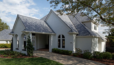
A white brick exterior paired with
Bellaforté Slate tiles in Castle Gray-VariBlend creates a truly timeless look for this traditional home.
Tip #3: Keep your colors from looking dated by avoiding these combinations
Is there a color that you once loved, but today would seem outdated in your home? Some of the answers I get for that question are avocado and gold, gray and mauve as well as chocolate brown and aqua. At one time, these color combinations were all very trendy.
Do you notice anything about those popular responses? Something they all have in common?
All of the examples are pairs of colors. Rarely does someone reply with a single color. That is because it usually isn't a particular color that puts a time stamp on your design. It is a combination of colors that were so popular that you began seeing them everywhere. You might have even chosen them for your own scheme.
At one time, a combination of chocolate brown and aqua was so wildly popular that I started calling it "Choc-qua." Today when you see a room in these colors you can pretty accurately guess when it was decorated.
Brown with a color other than aqua... or even aqua with another color such as gold or navy blue or green, would make it harder to know when a room was decorated just by the colors alone. Keeping that in mind, the best way to use a trend color is to come up with your own color scheme rather than using it in the same combinations as everyone else. This is the best way to keep your color from feeling either trendy or outdated.
Using a trend color you love more creatively than other people makes your scheme a true reflection of your taste and style... and that is always on trend!
More trend sources
Many paint companies have their trend forecasts for 2017 online and you might enjoy seeing what they have predicted:
Then follow my three tips and you will be well on your way to using this year's hottest hues in a scheme that sizzles with style all your own.


