
Search By Square Foot
• Up to 1000 Sq Ft
• 1001 - 1500 Sq Ft
• 1501 - 2000 Sq Ft
• 2001 - 2500 Sq Ft
• 2501 - 3000 Sq Ft
• 3001 - 3500 Sq Ft
• 3501 - 4000 Sq Ft
• 4001 - 4500 Sq Ft
• 4501 - 5000 Sq Ft
• 5001 Sq Ft And Up
Search By Square Foot
• Up to 1000 Sq Ft
• 1001 - 1500 Sq Ft
• 1501 - 2000 Sq Ft
• 2001 - 2500 Sq Ft
• 2501 - 3000 Sq Ft
• 3001 - 3500 Sq Ft
• 3501 - 4000 Sq Ft
• 4001 - 4500 Sq Ft
• 4501 - 5000 Sq Ft
• 5001 Sq Ft And Up
by Rachel Lyon, Editorial Director for The House Designers®
When homeowners decide to design with stone elements, they find practically limitless variety. We control cut and texture to a certain extent, and nature presents us with an overwhelming number of colors. Have you considered the ambiance you want your stone accents to support, and how they’ll interact with the rest of your space? Here are some points to keep in mind to ensure you choose a stone palette with the right tone, temperature, and level of contrast!
Selecting Tone
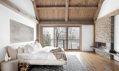
In terms of color, tone describes the quality of a hue—is it a deep, moody shade, or a bright and cheery tint? While pure colors are rare in nature, plenty of gorgeous tones can be found all around, including in stone. Describing the options can get complicated if you want to be technical, but in the simplest terms, it’s just a matter of how light or dark you want to go. Tone determines how the space interacts with its lighting and changes the feel of a room more than simply swapping one hue for another—consider the stark difference between a light gray and a dark gray or a light tan. All affect the feel of the space, but the brighter shades create more comparable ambiances.
Most homeowners opt for lighter stone accents for the same reason that they keep the walls white and don’t darkly stain hardwood floors—to avoid visually shrinking square footage. You can’t go wrong with a light and bright design. Deeper tones have their place, though, and they’re often used to foster a closer, cozier feel in key areas. If you have tons of living space to work with, dark stone can add drama, but don’t make this decision rashly. Bold, dark stone is tricky for amateur interior designers to balance with other features; subtler, light hues are much more forgiving. Take the amount of light available from windows and fixtures into account before committing. While you might employ a wall of deeper tones to complement a great room with huge sunny windows, don’t risk it if there’s any chance of looking dim or confining.
Choosing Temperature
Temperature is the easiest aspect for consumers to decide on, because everybody has a favorite color. Colors can be warm and energizing—red, orange, yellow—or cool and calming—blue, green, purple. Stone also falls into these categories, albeit in hues that are much less saturated; think of a warm, sandy limestone versus a cool, gray slate. If you envision your design with a particular temperature, you might be subconsciously sticking to your preference or assigning the vibe that you want to feel in that space. In either case, knowing a little bit about color theory can shift your opinion and help you make a better decision.
Due to their energizing nature, warm colors can help wake you up and focus. And because cool colors are calming, they can sneakily encourage you to relax and unwind. If you need any help in these areas, select a palette that sets the right tone. Even a subtle palette makes a big difference! Stone comes in light, neutral hues of both temperatures that are easy to incorporate into all styles. It’s a good idea to stick to these options inside, because bolder colors can come off too harshly to have the desired effect. Richer and darker hues are best left to the exterior, where they suggest regional influence—think a natural yellow-brown palette for Southwestern homes or deep gray for mountain homes, both of which are typically finished with local materials. Because some homes naturally gravitate toward warm or cool tones, you can also rely on your architecture to steer your decision.
Considering Contrast
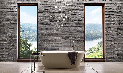
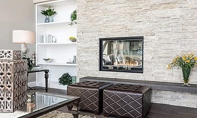
With the gamut of tones and temperatures to sift through, it’s easy to forget that most stone is not monotonous—it has natural variation on and between each piece. If you’re going for a blocky, industrial vibe, you’ll find simple, singly hued varieties, but the majority of stone palettes have some contrast. This adds an organic quality to a space, as well as a beautiful dappled effect when light hits it. Most homeowners are comfortable with low to medium levels of contrast, as high-contrast stone comes off very strongly, is more difficult to match, and ensures that it’s the center of attention.
Contrast comes in two main flavors: monochromatic and polychromatic. Monochromatic shows off a range of a single hue—such as tans, yellows, and golds, or shades of gray—while polychromatic includes at least two colors—you might find gray stones with the occasional reddish pop or a mix of multiple hues, which could err toward neutral or have enough saturation to really stand out. Polychromatic stone definitely makes a bolder statement overall, but you need to look at the whole picture to find the right balance. If a palette only has two shades that are starkly different, it’ll be more prominent than one with more intermediate shades, regardless of whether they all belong to the same color.
If you’re ready to add some gorgeous stone elements to your home, the experts at Eldorado Stone make it simple. Use their product selector to get on the right track quickly, or use their design services for recommendations with a human touch. Eldorado Stone has stunning, hand-painted stone veneer in every style and for any design need, available in multiple color palettes to ensure the perfect look for each project. Check out the possibilities—not often do you get the chance to add authentic yet tailored natural beauty to your home!


