SAVE $100 

by Kate Smith, Color Expert and Trends Forecaster
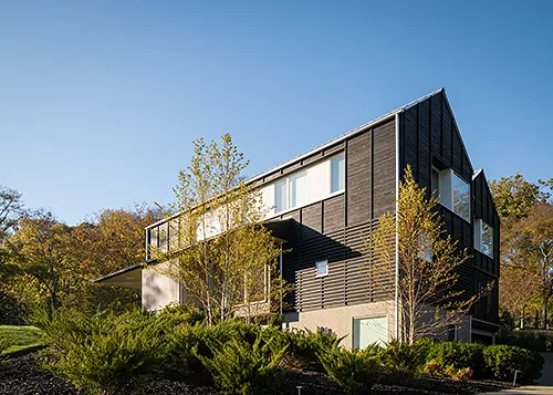
When working with homeowners, a little color knowledge can go a long way to end their frustration (and yours) when it comes time to choose colors for their home exterior. This quick lesson in understanding the characteristics of color will make it easier to help your clients choose the right ones.
Color Communication
In order to organize and communicate about color you need to know three characteristics: hue, value and chroma. Now don't click away because you think I'm about to get all scientific on you because I'm not. These are just the technical terms for how you already talk about color every day. If you’ve ever described a color as light blue gray or deep dark green, you’ve expressed all three of these attributes.
Let's break it down because these three characteristics are actually what your clients are trying to get right. When a homeowner doesn't like a color generally it is because one or more of the characteristics is off or not what they had in mind. That is when the frustration starts. When you know how to think of the color in terms of its characteristics, you can put an end to their frustration.
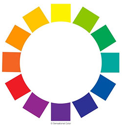
This color wheel illustrates just a handful of hues in the visible spectrum.
Hue
Hue and color are often used synonymously, but hue refers more specifically to the colors of the visual spectrum— red, orange, yellow, green, blue, and violet. These hues, along with the six intermediate hues of red-orange, yellow-orange, yellow-green, blue-green, blue-violet, and red-violet, are the pure colors that circle the color wheel. These twelve hues—also often called color families—can be blended to produce an untold number of colors.
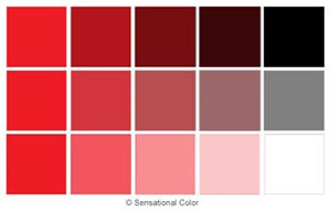
Value
Value describes the lightness or darkness of a color in terms of how close it is to white or black. Blending black with a pure hue darkens it; conversely, adding white lightens it. This changes the amount of light emanating from the color, which changes the color’s value. The lighter the color, the higher its value. For example, navy blue emits less light and has a lower value than sky blue.
The value of the color along with the texture of the surface it is applied to will affect the amount of light reflected. To help determine the value of different colors most paint companies include the LRV (Light Reflectance Value) on the back of the color samples or in the index of the list of colors. The higher the LRV, the more light reflected. Color with lower LRV reflects less light. A white or very light color will have a high LRV, while a dark one will have a lower LRV.
Some areas specify that colors be within a certain LRV range. In Tucson, Arizona, there are guidelines that homes must be constructed with materials that fall within a certain LRV range, to ensure that an earthy desert look is consistent throughout the town.
Guidelines for LRV are also often used to conserve energy in a building. For example, in a hot climate if you want your home to absorb less heat you would use a lighter LRV (of 50 or higher) and smoother finish. In cooler climates a darker and more coarsely textured surface could serve to keep a home warmer.
Also, some materials have LRV recommendations. For example, most vinyl manufacturers recommend using an LRV of 55 or higher when painting PVC/vinyl.
By hearing you explain and give some examples, your clients will be able to see that there is more to understanding color value than they may have realized.
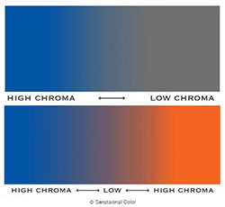
Chroma
Chroma is the attribute that expresses the brightness or purity of a color. You may not be familiar with the word chroma, because this characteristic is often expressed using the word intensity or saturation. The human eye does not easily perceive the differences between intensity and saturation, thus the terms are often used interchangeably.
The closer colors are to their pure hue the higher their chroma. High chroma colors are described as clear, pure, brilliant, bright, rich, bold, or vivid. Colors that are less intense or saturated are described as toned-down, soft, muted, subtle, misty, dull, drab, or dusty.
This is the characteristic of color that often trips people up most when it comes to finding a color that matches the one they have in their minds. Here's why.
When we look at paint samples, we are naturally attracted to the color we think looks prettiest or best on the color swatch. Those colors, however, are rarely the ones we like painted on our homes. Once that color that looked so pretty in the paint store is spread out over one or two stories it often looks too bright and is much more colorful than what your clients had in mind when they were looking at the swatch.
When clients find a home painted in a color that they love, they are often surprised at how blah the color looks on a small paint swatch. That is because the full beauty of many colors, especially a neutral color, isn't apparent when looking at such a small sample. Only once they see this less "colorful" paint on a home can it come to life and attract their attention.
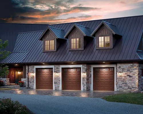
Colors like SW 7657 Tinsmith or SW 7015 Repose Gray may not jump out at homeowners when they look at the small samples, yet this may be just the color they need to enhance the cedar shake roofing or the stone they have selected for around the entrance. SW 6215 Rocky River may not look like much when you see only a 2" square, but it may look beautiful on shutters. I think you get the point.
The bottom line is that most of the time the colors that will work best on their home exterior are not the ones your clients think look the best on the swatches. Yet the color they are actually looking for is far more likely to be one that they passed over during a first glance thinking it was too dull. Slow them down a bit. Use what you have learned above to educate and help them understand why those more toned-down colors deserve a second look.
Look at the color your clients are attracted to. Then show them the actual color that will allow them to achieve the look they are after. By being able to clearly explain how and why color changes, you can guide your clients to an exterior color they will love on their home.