SAVE $100 

by Lauren Busser The House Designers’ Editorial Director
French Country style has been very popular ever since its introduction after World War I. French Country designs are popular because of the intriguing blend of rich details with rustic elements. The result is a comfortable yet rich-looking space. Whatever your decorating style, your color palette is a great way to tie the room together and get that inviting feeling that French Country homes are known for. There are lots of color palettes that can be defined as French Country and here are a few basic palettes to draw from.
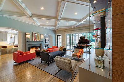
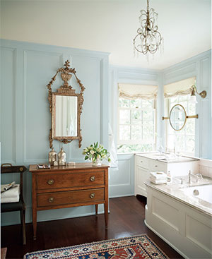
Red, White, and Blue
You may recognize these colors as being the colors of the American or French flags, but they are definitely not the bright shades you will see on a country’s coat of arms. When it comes to red, white, and blue, designers think of subtle shades that evoke the idea of this classic palette but don’t scream the colors of the flag. Reds can be anything from tomato to pomegranate or raspberry, blues can go from aqua to midnight blue, and whites can run the gamut from milky whites to gray stone colors and ivories.
Using this color palette successfully means that you have to translate it so that it works in your space. Keep most of your walls in one color, preferably white or gray. If you are adding an accent wall or painting trim you can add a discolored or muted red. While you are furnishing the room you can bring in other colors, maybe even some bright tones to tie the room together and give it a dimensional look.
While not strictly necessary, this color palette usually works best when one color dominates over the neutral background. Pick red or blue furnishings and use a variety of shades for your accents.
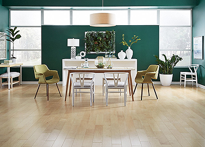
By the Sea
You may think that seaside colors have to be reserved for the sea but in reality you can use these colors anywhere in the country. Seaside palettes usually consist of blues and greens.
You can play the look of the blues and greens up or down by adding yellowish wood-tones that are complimentary to the blues and greens. These tones inject some warmth into a cool color combination if you want it. You don’t have to pair seasides blues and greens with wood tones only. This palette looks great with brick floors, terracotta tiles, and cement flooring.
If you want to go for a completely cool look you can do so by adding antique white tones to the blues and greens. Linen and lace can create a real sense of luxury. You can also create a vintage feel with unbleached linen and darker hues of green, blue, and gray. Adding off-white and ivory accents can also help bring together a room’s vintage feel.
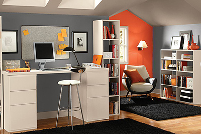
Natural Beauty
Neutrals are another favorite when it comes to contemporary French decorating. Neutral color palettes vary widely with some people favoring entirely French neutral color schemes. While neutrals transcend all decorating styles they look great, particularly with a restrained color scheme.
Additionally, neutrals can be paired with an accent color. Some popular colors that work really well in French Country decorating are: green, blue, pink, red, and yellow. Any of these colors can mix well in a variety of shades.
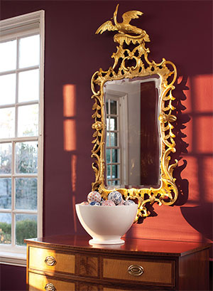
Gilded Accents
There is nothing wrong with adding a touch of gold into your French Country color scheme. Remember, the cornerstone of French Country design is luxury mixed with a welcoming rustic atmosphere. If it's good enough for a castle there's no reason not incorporate some gold into your cottage.
If you decide to take this approach, start by adding little touches of gold to your picture frames, glass and china, and even your wall stencils. The more gold you add, the more glamorous your space will feel.
Remember that the goal of French Country design is a luxurious feel juxtaposed with a welcoming atmosphere. French Country color palettes are extremely varied. With a little bit of time you are sure to find a palette you will really love and Benjamin Moore’s® extensive color palette is a great place to start your search for the perfect color.